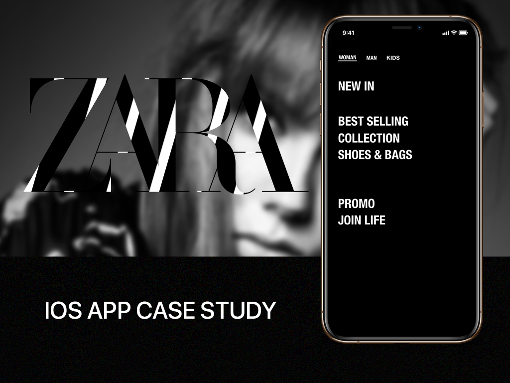
Having a mobile online shopping app is a popular approach for businesses to provide consumers with additional convenience, efficiency, and control. Because of competition, a significant challenge for businesses is attracting and retaining customers. Zara is one of the largest retailers that specializing in fast fashion, with a wide range of items and an excellent online shopping experience for customers.
As a major lover of Zara’s merchandise, I’ve observed certain unfavourable usability challenges when using the app on my IOS phone that may affect consumers’ purchasing experiences. As a result, I decided to redesign the ZARA phone application to improve the user experience.
The Goal
Redesign the category and review the system workflow to make shopping easier, more effective, and more delightful.
The Challenge
Zara is a globally recognized apparel brand, and many people like shopping there. A frictionless shopping experience will improve their happiness, perhaps leading to greater purchases. As a consequence, ZARA must decide how to emphasize the app’s content.
Tool
Adobe XD, Adobe Photoshop
Device
iPhone
The Role
User Interviews & surveys
Empathy map
User persona
Information Architecture
User flow
Hi-Fi mock
Visual Design
Validation
Design Process
I began my project using the Design Thinking Process in order to handle the entire user experience. Throughout the various stages, I engaged a range of design methodologies and tools to gather information and insights for my design.
User Research
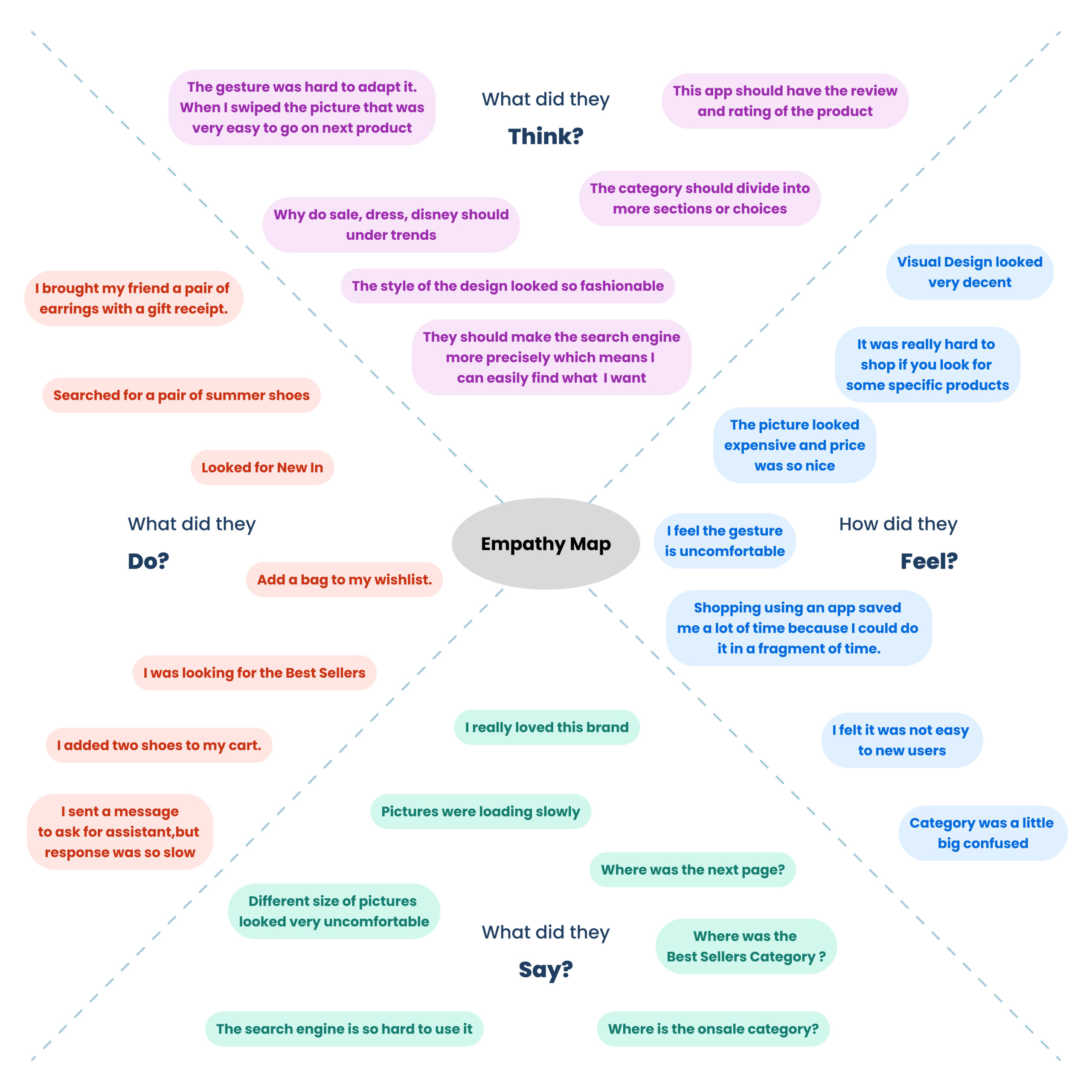
Conducting interviews with friends and acquaintances who are youthful, price-conscious, and highly sensitive to the latest fashion trends. After the interviews, I created an empathy map in order to create a persona.
Conducting Research Interview Plan
Extract information from users for user experience understanding, usability understanding and ideation
Purpose
The purpose of this study is to find out how our target group uses the ZARA IOS app. When, where, and how users use the app in their daily lives may all affect their overall experience. I need to get an understanding of this so that I know what solutions would be most relevant and helpful to our target group.
Method
I will do 10 contextual interviews with people who are young, price-conscious and highly sensitive to the latest fashion trends and show me how they think and feel about the app.
Participants
Participants will be people aged 25-45 who want to have fashion outfits at better prices and to have better experiences with mobile shopping. Since I have 20 days to carry out the study I will ask people from the local area through networking and posting on social media.
Location
I will do the interviews in a cozy coffee shop. I want interviewees to feel relaxed while doing the testing, and I can see their outfits as well.
Empathy Map
After conducting interviews, I generate ideas and insights that clarify the consumers’ primary demands. So I created an empathy map to provide a thorough understanding of the target audience.
User Persona
According to the Zara Retailer report, the target market is women (here only discuss women), 18-40 years of age, who are very fashion-forward and trend-conscious, residing in an urban area. Zara’s customers are definitely sensitive towards having the most up-to-date and fashionable clothing and accessories at an affordable price. Along with my prior results, I created a goal-oriented persona for Zara iOS app users.
Define
Creating a point of view problem statement to understand users’ needs and insights
Pain points
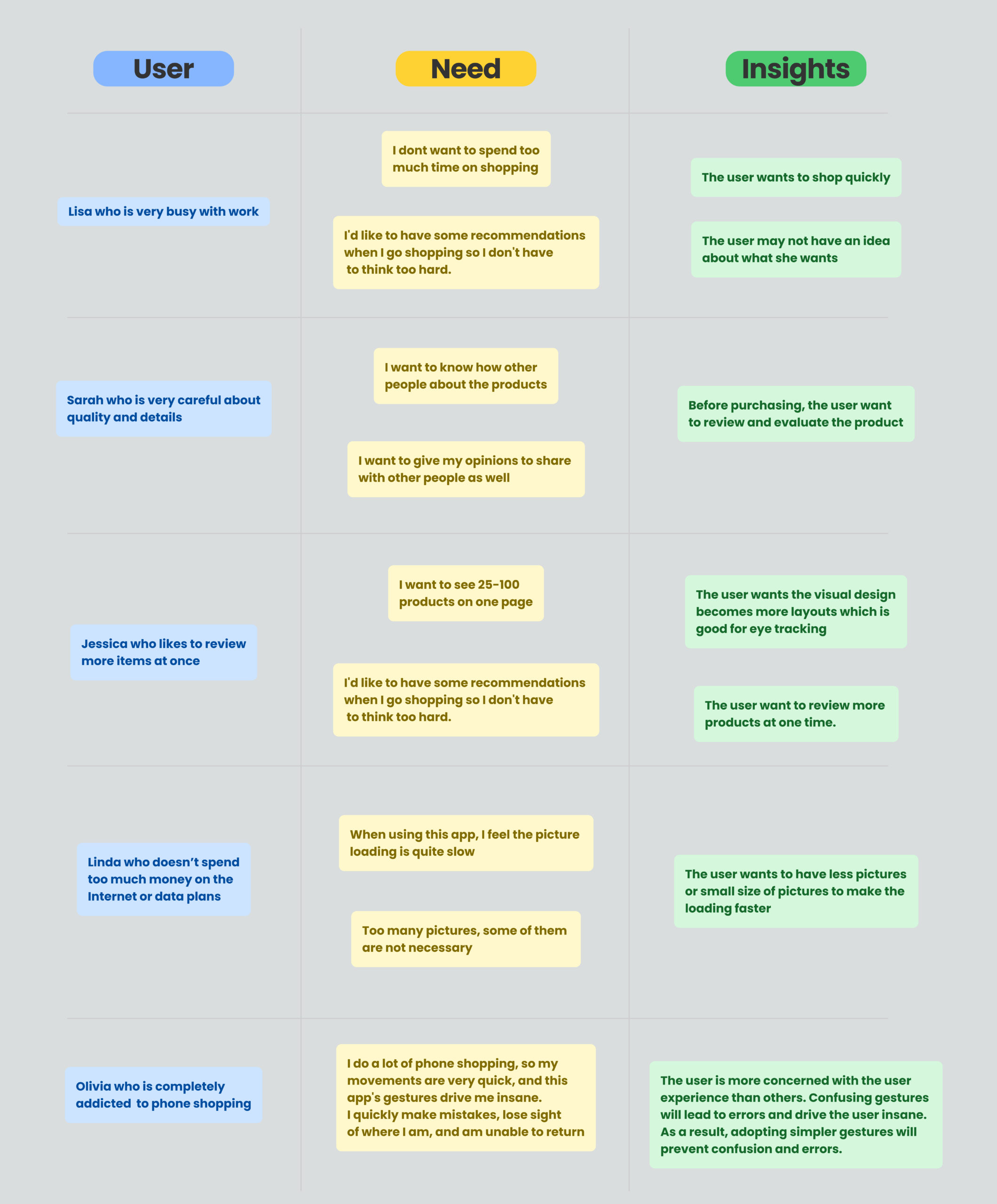
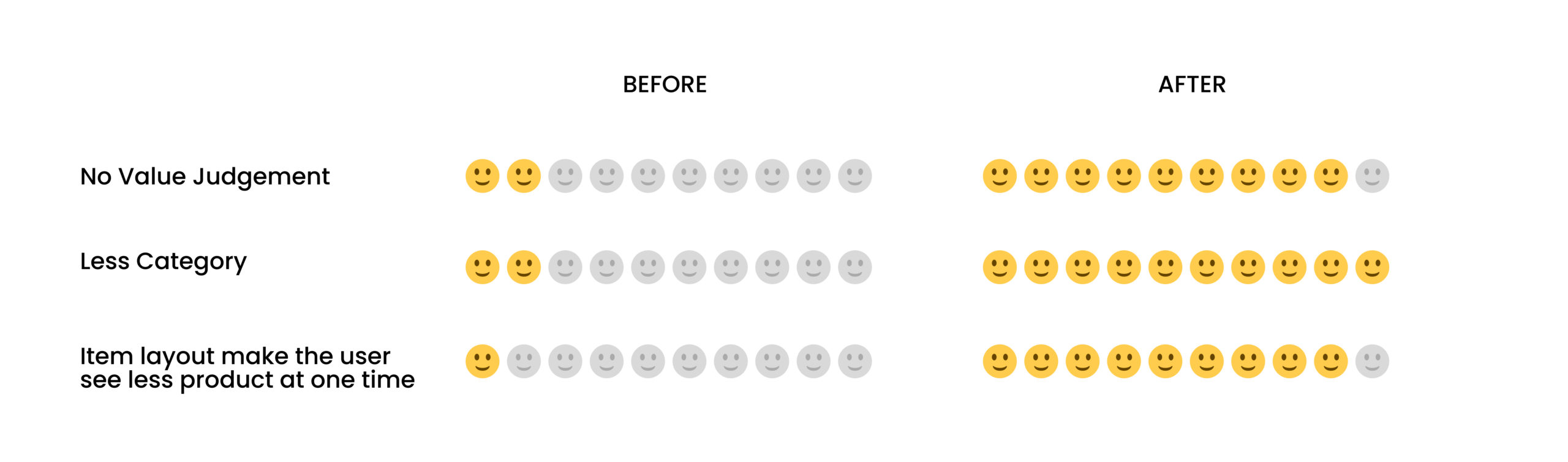
After evaluating with typical users to critique, I identified three major pain points to improve on, which are listed below:
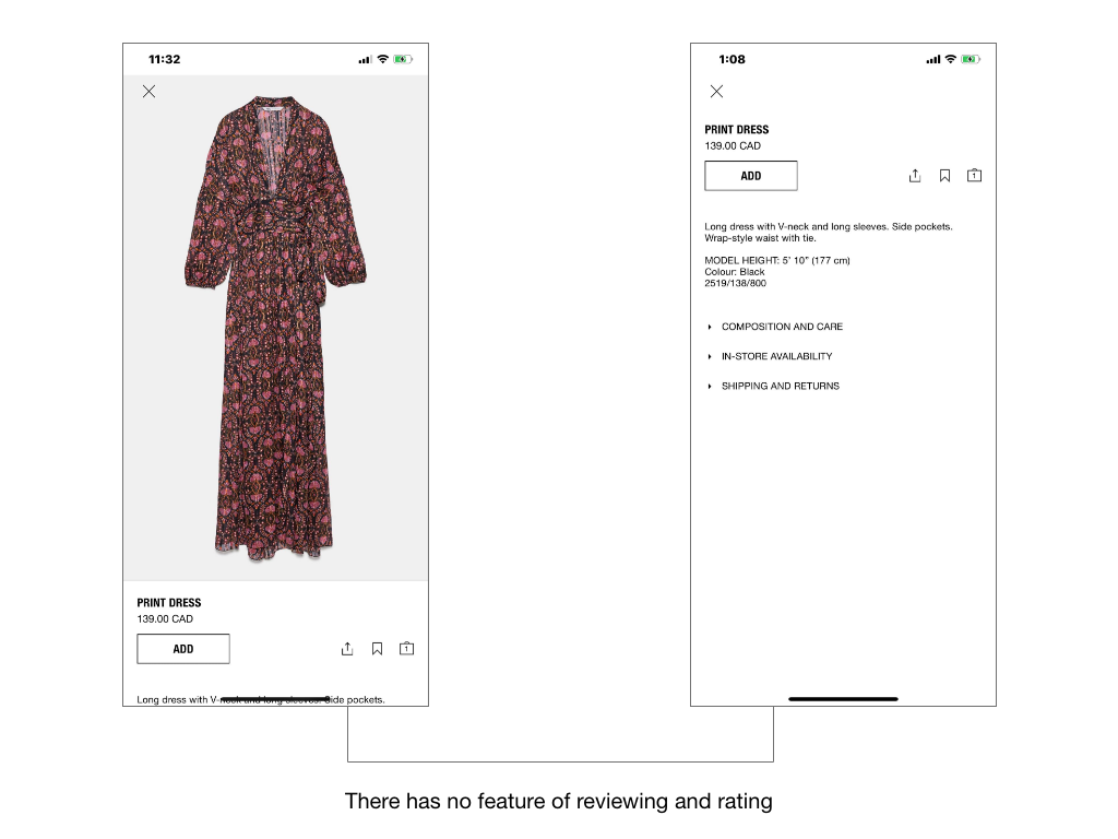
Pain Point 1: No Value Judgement
Because there was no evaluation, the majority of consumers struggled to decide whether to purchase the product or not. As a consequence, the review and rating system is crucial in convincing people to purchase the product without hesitation.
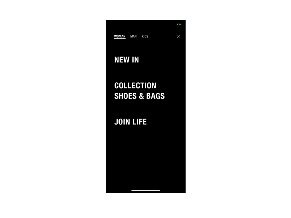
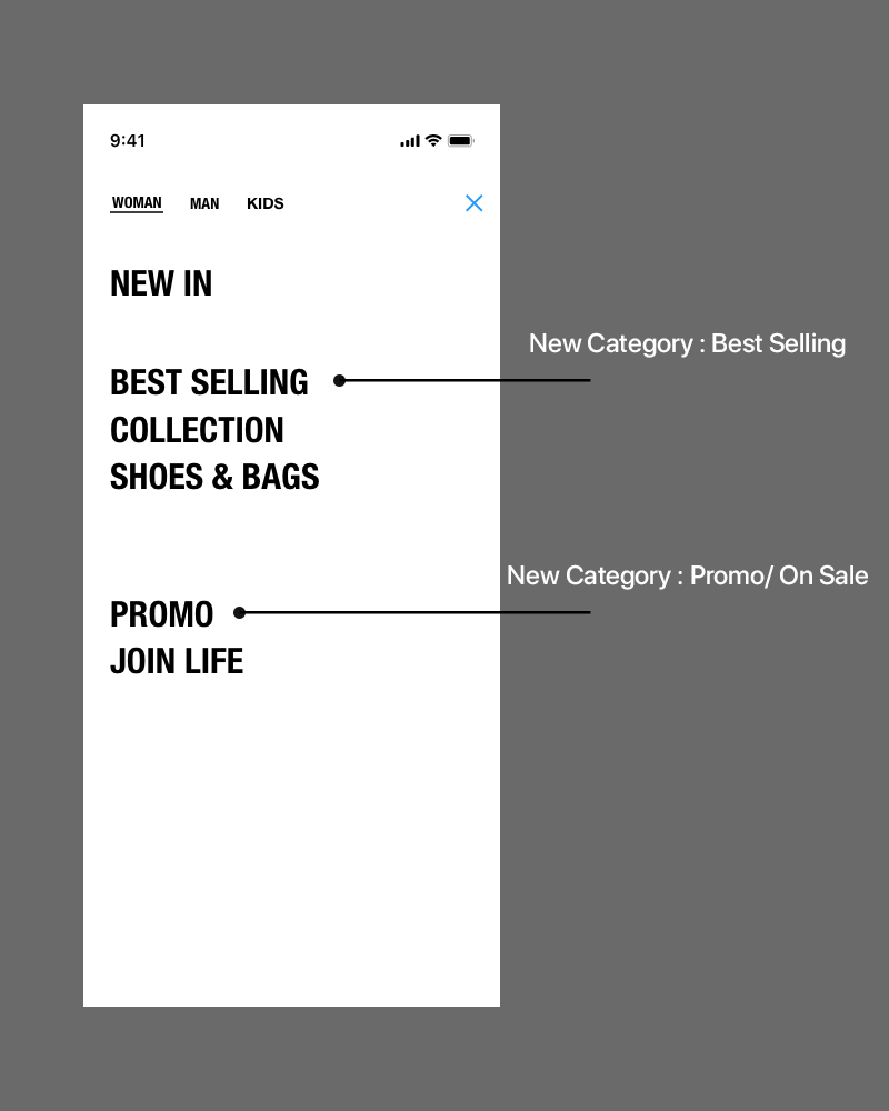
Pain Point 2: Less category
According to my research and point of view statements, we discovered that people prefer having more categories to choose from rather than spending more time exploring. Furthermore, providing more useful categories helps customers with additional possibilities and recommendations.
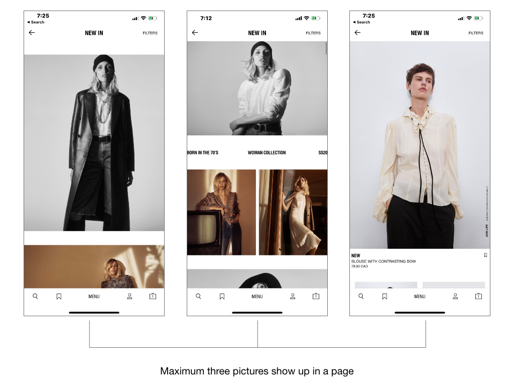
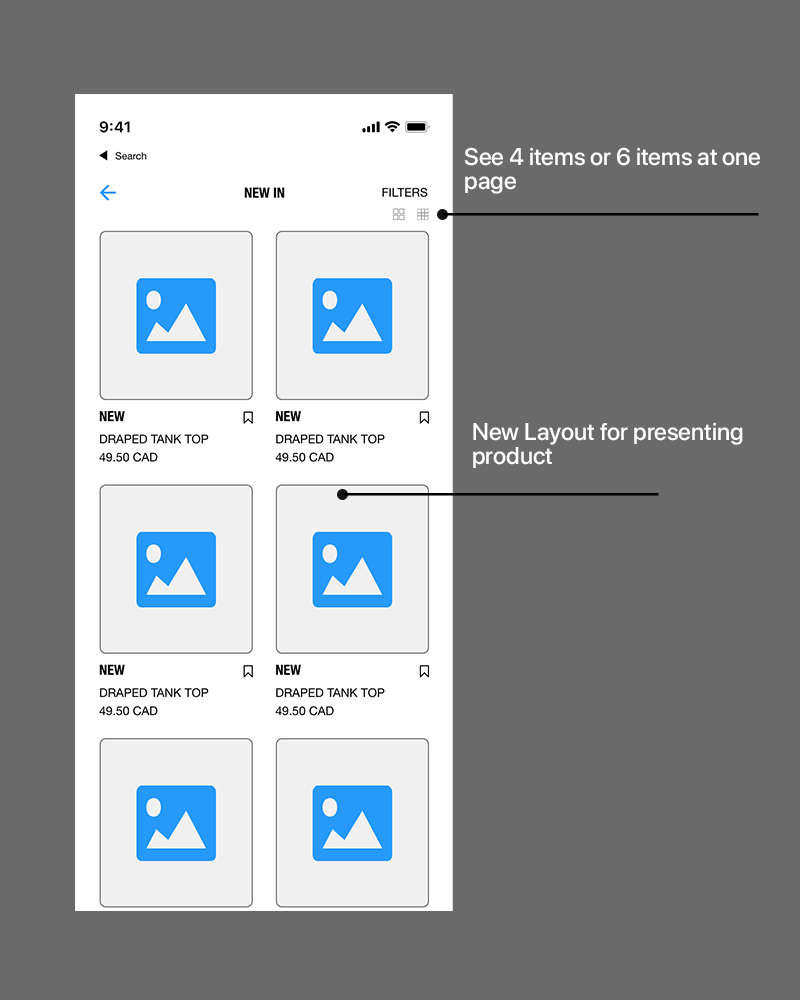
Pain Point 3: Items layout makes the user see fewer products at a time
Most users want to view many objects at once, which saves time and is beneficial for an eye scan. Therefore, the arrangement of images or products is a waste of users’ time.
Ideate
Based on our research and define, I made some improvements to develop a better user experience.
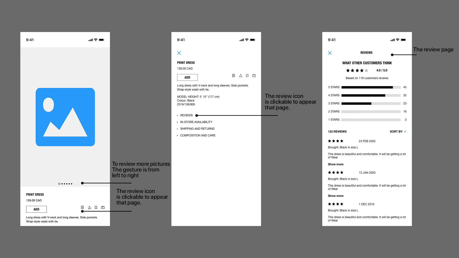
Pain Point 1: Add the review function to the app
The original design was straightforward and functional, but it lacked a review system. As a conclusion, I added the review button and detailed information to allow people to make a value assessment. I brainstormed and sketched to address the details listed below.
Pain Point 2: Put 2 more categories including Best Selling and Promo
As we know from the point of view statement, I was dedicated to satisfying the various demands and expectations of our customers. Therefore, I created two more options, Best Selling and Promo, to help align the needs of the customers.
Pain Point 3: Changed the image arrangement to show more than pictures on one page.
The majority of users desired to view more than three images on one page in order to improve the speed of scanning and discovering. Therefore, I designed a new layout to deliver a fresh look to satisfy their needs.
Validation
Conducting user testing with a group of users has allowed me to identify and resolve the pain points, and the results were positive:
1
Users had no hesitating to purchase products because the reviewing system was quite helpful.
2
Users have more product categories to browse and better suggestions to follow.
3
Users could see several pictures on a page instead of scrolling down often, which greatly enhances the user experience.
What I have learnt
I learnt how to use design thinking to help users find out their pain points, and based on user’s needs and insights, I came up with useful solutions to troubleshoot. It was quite important to interview face to face because it gave me not only answers but also helped me read their emotions. Analyzing data gave me data-driven thinking that led me to figure out pain points. Meanwhile, the whole process made me deeply understand why we need to design based on user-centred design methodology, and I will advocate human-centred design in the future.